LandAirSea Brand Refresh (B2C)
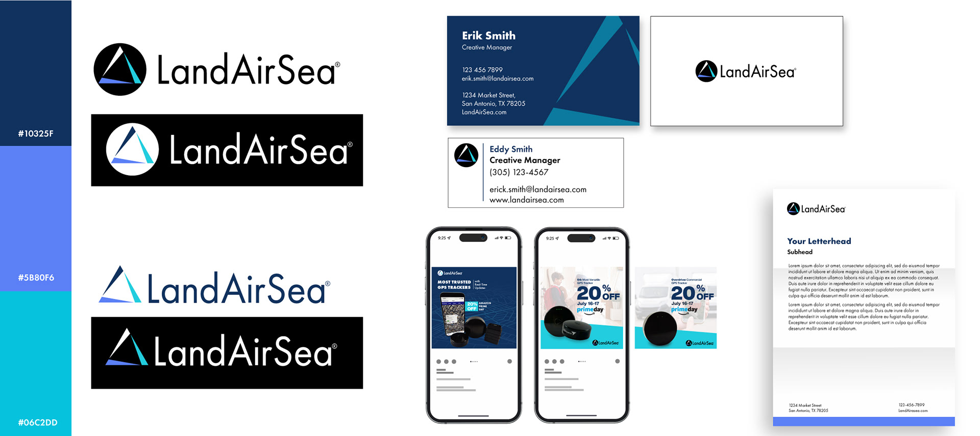
The visual refresh of LandAirSea focused on giving the consumer-facing brand a more modern, tech-oriented look. The goal was to move away from the older, utilitarian style and align the identity with the company's shift toward smarter, more connected tracking solutions. The original mark was kept but supported with updated typography and a refreshed color palette to create a cleaner, more polished visual system. The new colors were chosen to feel bold and energetic, helping the brand stand out while still feeling approachable to consumers in the tech space.
The visual refresh of LandAirSea focused on giving the consumer-facing brand a more modern, tech-oriented look. The goal was to move away from the older, utilitarian style and align the identity with the company's shift toward smarter, more connected tracking solutions. The original mark was kept but supported with updated typography and a refreshed color palette to create a cleaner, more polished visual system. The new colors were chosen to feel bold and energetic, helping the brand stand out while still feeling approachable to consumers in the tech space.
Tracking Technologies – Brand Development (B2B)
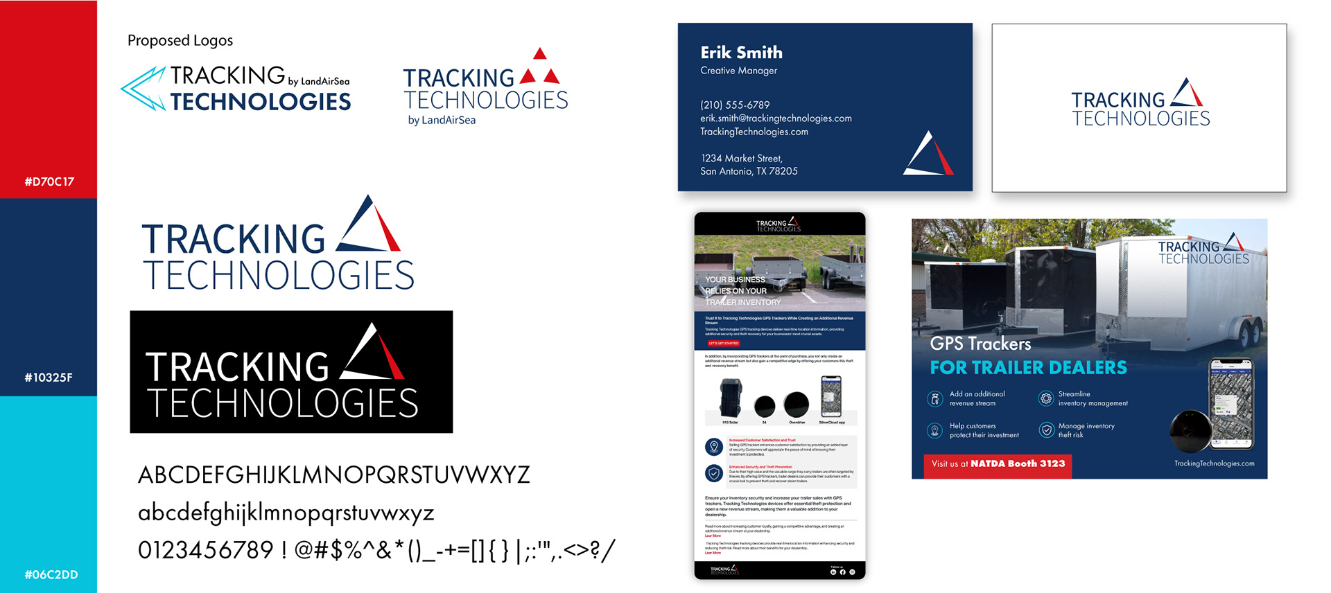
Tracking Technologies was developed as the B2B counterpart to LandAirSea, with a focus on serving business clients in industries like logistics and fleet management. I created a new brand identity that feels more serious and professional, using cooler tones and a refined layout system. The logo shares a core symbol with LandAirSea to show brand unity, but its color and application were adjusted to reflect a more corporate, trustworthy tone. This system ensures visual consistency across both brands while clearly separating their intended audiences.
Tracking Technologies was developed as the B2B counterpart to LandAirSea, with a focus on serving business clients in industries like logistics and fleet management. I created a new brand identity that feels more serious and professional, using cooler tones and a refined layout system. The logo shares a core symbol with LandAirSea to show brand unity, but its color and application were adjusted to reflect a more corporate, trustworthy tone. This system ensures visual consistency across both brands while clearly separating their intended audiences.